How do you explain the taste of sake to someone who has never drunk it? It’s a pressing question for anyone working to popularize sake in the UK.
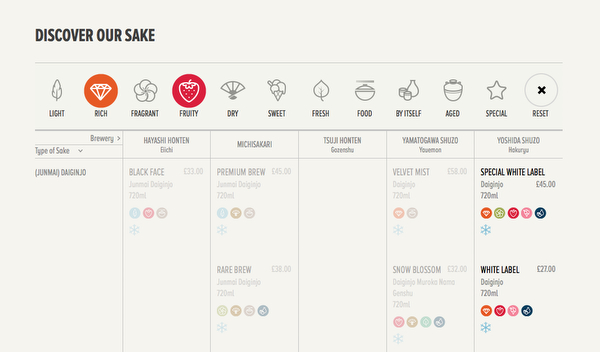
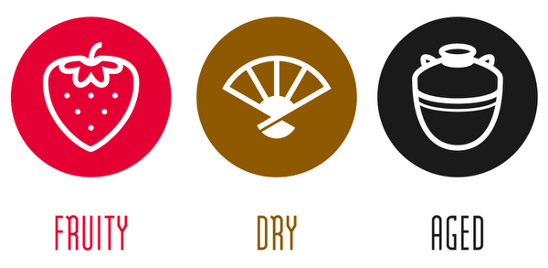
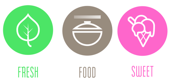
Tengusake.com, an online sake shop based in the UK, uses a colourful and ingenious system of pictograms to help customers choose sake and match it with food.
I asked the site’s owner, Oliver Hilton-Johnson, a few questions about the system, and about helping non Japanese-speakers learn about sake.

Where did the idea for the pictogram system come from?
For a number of reasons, entry-level premium sake is more expensive than entry-level wine. As a result, people are less likely to take a punt on sake. If you’re spending £30 you want to know what you’re getting!
I wanted a system that allowed people to make an informed decision without them having to have in-depth sake knowledge. Specifically, I wanted to engage a non Japanese-speaking audience.

How did you choose the categories? Were there some you thought about including but decided against in the end?
The categories were a result of much thought and much sake drinking! I did a lot of market research and focus groups into what information people wanted. But because sake is such a nascent market and, often, a misunderstood beverage, I ended up devising parameters I thought would be useful.
Furthermore, the pictograms go some way to challenging some common misconceptions. For example, by having a category of ‘fruity’, it challenges the idea that sake is rough, and by having ‘light’ it challenges the idea that sake is a harsh, strong beverage.
I notice that there are no Japanese terms. Why didn’t you include daiginjo, junmai etc?
The Japanese designations are included on the website and on every bottle. The pictograms graphically represent parameters that enable people who are not very familiar with sake to engage with the product.
But for those that are more familiar with sake, there are the full Japanese names of the products, the Japanese designation terminology, and even the full specs including nihonshudo, amino-do, san-do, rice variety, seimaibuai, etc. Again, these are on the website and the bottle for every sake.

What does the “special” pictogram represent?
Basically it covers anything that is out of the ordinary. It include things like sake made using the ancient bodaimoto method, koshu, etc.
Did you translate the sake brand names too?
I did, in consultation with the breweries. Sometimes it was translation but a lot of the time there was no direct translation and so we had to come up with entirely original English names.
Sake labels are quite beautiful, but not easy to read either. What could brewers do to help foreign sake fans?
They are beautiful! Research indicates that part of the allure of sake is the beautiful labels and exotic script. My advice for brewers is not to make overly westernized labels. I’ve seen a few of these and I think they are a mistake. Instead, keep the beautiful Japanese designs, but make some concessions by including western text. The name at least would help!

Anything to add?
I think it is really interesting the amount on sake that it being made outside of Japan. Japan currently has a real advantage in so much as it has the expertise and ingredients to a higher level than elsewhere. However, the rest of the world is beginning to catch up. Japan is in danger of being too complacent (or too uninterested) and finding itself outmaneuvered in the global market by foreign producers.
It hasn’t happened yet (there are still too many issues with achieving a top quality product), but there are some non-Japanese producers that are beginning to be a threat.
It will be very interesting over the next few years to see how this plays out and, also, how Japan defends the quality of the sake brand. Will there be a move towards an appellation d’origine contrôlee system? There have been attempts in the past that have failed, so who knows!
