Sake labels that work in Japan don’t always work for overseas markets. As sake appears on the cusp of a major export boom, could it be time to try some new ideas?
Neil Tully heads Amphora, the only UK design consultancy that works specifically with the wine trade. He talks about what makes a great wine label, and how labels could help communicate an often unfamiliar drink like sake to consumers outside Japan.

Why are you called “Amphora”?
Amphora were the first vessels built to contain wine, used by the Roman. And we are based in Bath, a Roman city.
How have you seen wine labels change over the years?
We did have a flurry of quite flippant designs that did a good job at attracting customers. But now the pendulum has sprung back a little to more conventional design. It’s mirroring the way wine drinkers have got used to wine.
What’s important in a label design?
One of the most things is clarity and simplicity. You’ve got the subliminal stuff, but people do actually read wine labels, so hierarchy in presenting the information is vital.

Any tips for sake label designers?
I suspect the answer is probably different for different sections of the market, but for the upper level, authenticity is vital. The label has to press the right buttons, but still be Japanese.
What’s your impression of sake labels you’ve seen?
To my eye they look authentic and belong to where they come from. I’ve been studying Mandarin Chinese for three-and-a-half years so I appreciate the beauty of the characters. Having said that, modern Japanese design is certainly fashionable here. But I don’t see much of that in the labels. Maybe it’s a missed opportunity?
One other thing that’s critical is brand. Sometimes, the brand rather than the packaging can do the communication. There’s potentially a big opportunity for someone to bring a sake brand message, and build a relationship between consumers and that brand.

How could labels help make sake more accessible?
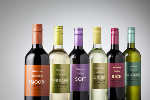
I think we are living in an age where consumers are more prepared than ever to experiment. We did some work with the UK supermarket Waitrose on entry-level wines. The designs were very bold and simple, but not dumbed down. I think the message can be simple. But if it is presented beautifully, then it can work.
Bottles send out very strong signals too. One thing to do might be to look at how sake bottles work on export markets. Spirits in particular have done some terrific things with glass. With some sake, there seems to be a bit of a disconnect between the bottle and the label.
What are the pitfalls of not being authentic?
We refer to international design here. It’s trying to please everyone and it can result in a look that’s very corporate. I believe in honesty. We try to find positive and true associations that people can relate to.

